
Evolution of global GDP and global life expectancy disparities
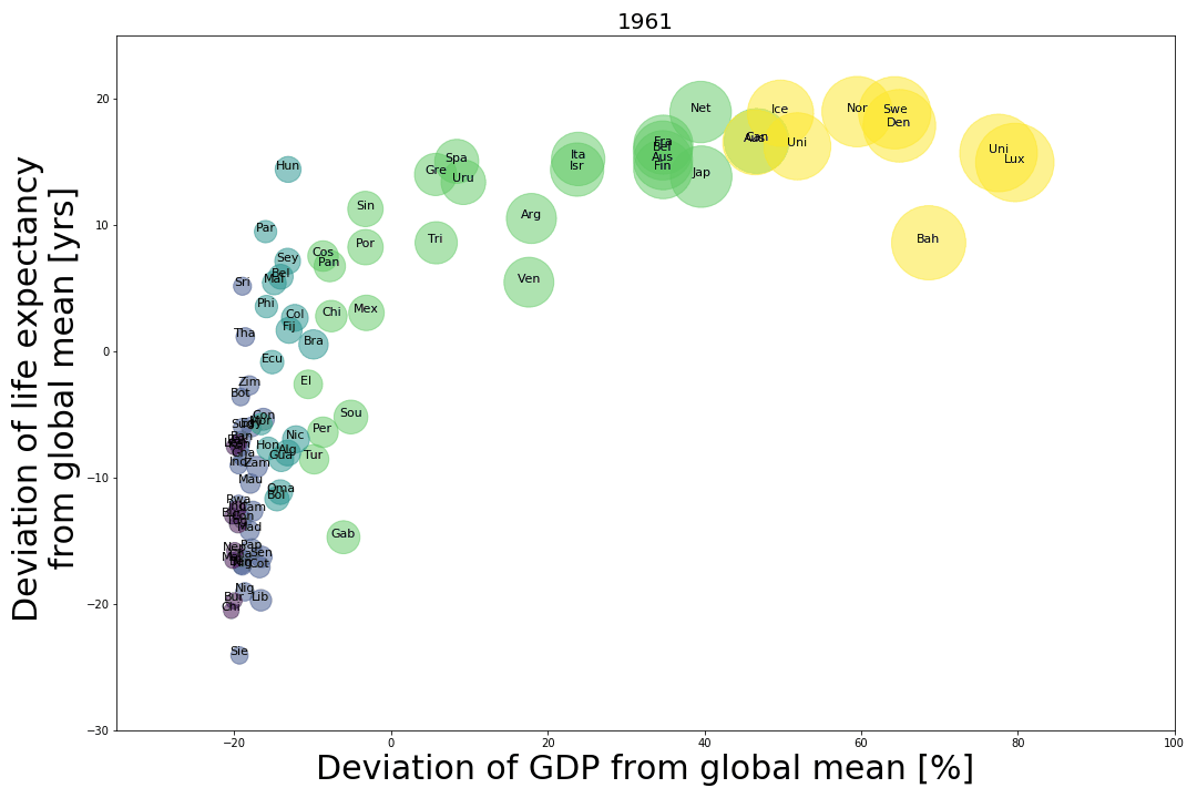
The bubble colors indicate the GDP percentile group to which they belonged in 1960. Bubble color coding : GDP percentile (0-10] is dark purple, (10-40] is violet, (40-60] is blue, (60,90] is green, and (90,100] percentile is yellow.
Throughout the past sixty years, the distribution of countries by GDP has seen very few variations. With few exceptions, countries marked with yellow bubbles are the only ones in the further right, dark purple and violet remain further to the left, and countries with green bubbles remain at the center. There are exceptions: try tracking Japan.
There is little vertical movement in the graph, showing only small changes in the past sixty years of the life expectancy with respect to the global mean.
*There is a ten year gap in the data between 1980-1990.
#ThingsThatMatter